Fish Gotta Swim Editions
Wanda. Lambert, Barbara. Fish Gotta Swim Editions, 2021.

Winter Wren. Kishkan, Theresa. Fish Gotta Swim Editions,
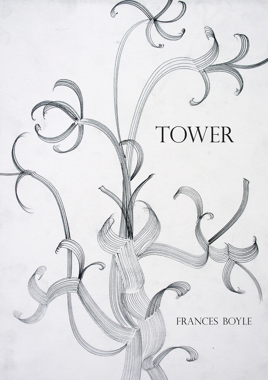
Tower. Boyle, Frances. Fish Gotta Swim Editions,
Tell me about the how Fish Gotta Swim press came to be?
Theresa Kishkan: This is the way I remember it. We’d both been been writing novellas and we often talked about them when Anik lived in Pender Harbour, where I live, and later, by email, once she’d moved to the Netherlands. I don’t think I’m wrong in remembering that publishers used to be more open to the idea of publishing a novella as a single volume. My own Inishbream was published by Goose Lane Editions a couple of years after it had already been published in a limited edition by the Barbarian Press and in those years – the early 2000s – Goose Lane kept space on its list for novellas. But later, when I’d finished Winter Wren, no one would even consider it. Anik had published Postcard, a collection of short fiction which included her novella of that name, and was working on another, Cabin Fever. I remember she was heading back to the Netherlands after a few months in Dawson City as Writer-in-Residence at the Berton House and she stopped to spend a few days with us. We were sitting by our fire, having a glass of wine, and we talked about our work, how difficult it was to publish novellas in the current publishing climate, and then we both laughed. We’d come to the same conclusion at more or less the same moment: that we would set up a small enterprise to publish novellas. We both loved the form, its capacity for intense language and stylistic innovation, for concentrating time and place into a brief but compelling narrative, and we wanted to showcase these qualities, to honour brevity in small beautiful volumes. Although we both have some experience (her far more!) with letterpress, we wanted to find a way to make the books we published available to general readers without sacrificing design elements and literary quality. We agreed to initiate our imprint with my Winter Wren because it was more or less ready to go and reasoned that if the project somehow failed miserably, we wouldn’t be disappointing anyone but me! I was willing to be the guinea pig (though I am also hopeful that Anik will agree to let her Cabin Fever appear as a Fish Gotta Swim novella too). And the name of our imprint? Well, Fish Gotta Swim—because they gotta...
Anik See: I have nothing to add, though Theresa has, in her gentle way, been much more of a driving force in this than I have! She's the one who keeps our readers and followers interested, keeps things running.
What are the challenges of the international collaboration between you both? In what ways is it an asset to be spanning two continents?
Theresa Kishkan: We knew from the beginning that there would be challenges. What could be seen as a barrier to good communication – being continents away! -- isn’t really at all. We knew that our individual strengths or geographical realities were different so how could we make that work? We would both read submissions and hoped we would agree on the ones we were interested in publishing. We knew we could both edit. Anik has design skills and experience so that would be her responsibility, with input from me (and our authors, when appropriate). Decisions about design and so on are fairly easily done by email. When we considered how to divide the labour, we reasoned that most of the orders would come from Canada, or at least North America, though we’re hopeful that this won’t always be the case. That meant using a Canadian printer, one who would be able to deliver fairly small print-runs economically, without compromising quality production. I looked at small press books I had in my house and saw that many were printed by the same company, located in Victoria. The next time I was there, I made an appointment to talk to the printer and he showed me paper samples, cover choices, and the prices were excellent. I remember taking notes and then emailing Anik in some excitement, wanting to talk about it right then! (When I’m thinking about contacting her by email, I now keep in mind that due to the metaphysics of time, she is 9 hours ahead.) We’ve had the occasional phone conversation and we always schedule a Skype date or two per book, to discuss design details or to look at the proof copy our printer sends. Sometimes I think of us each doing some heavy-lifting, Anik designing the book block and making endless adjustments and corrections as we proof, as our authors proof and change their minds and request just one more tweak, and me receiving the boxes of books and filling the orders, and each of us doing some shared stuff that is almost always pleasurable --talking to our authors, thinking about the next book, celebrating the good reviews and the quiet delight of realizing that our fish are swimming, swimming, beautifully and happily.
Anik See: I don't really see working so far apart as a challenge. We're both from Canada, which means you adapt to distance. If I'd have to name something it would be logistics, like printing and mailing our books. We made the decision early on to print in Canada because we found a good printer for a reasonable price, and our readership is mostly Canadian. But that makes shipping internationally costly. That having been said, I think the advantages of spanning two continents outweigh the disadvantages. Living in Europe, I'm surrounded by the European design aesthetic, which is bolder and more confident than North America's (in my opinion) - and that influences the design of our own books.
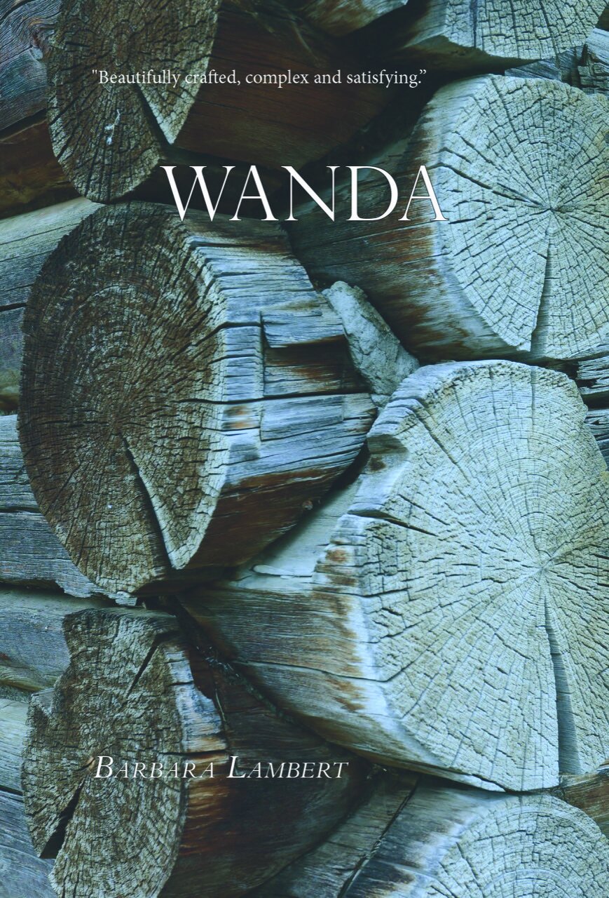
Why Wanda? How do you choose what to publish?
Theresa Kishkan: Lambert sent Wanda to us because she has followed our publishing efforts and she wanted her book to be part of our list. Her earlier novella, “A Message for Mr. Lazarus”, won the Malahat Review Novella Prize in 1996 and was the title story in a collection published in 2000. I’ve often thought that B.C.’s Interior in general and the Okanagan Valley in particular are not well-represented in Canadian fiction and so to read her elegant and elegiac story of a child growing up in an orchard community in the early years of WW2 was so satisfying. I was glad that Anik felt the same. I’m not sure we know exactly what we’re looking for but I do believe we know when we’ve read the right work. There’s been remarkably little arm-twisting on either side.
Anik See: I think the voice of Wanda is a composite of voices that are not-often-heard: that of young girls pushing boundaries; of German immigrants living in Canada during the Second World War; and rural existence. It's original, but totally believable and yet also somehow universal. That's a rare combination. And it's well-written. When something like that comes across your desk, it stands out from the rest!
Tell us a bit about the design process that goes into your books? What choices do you enjoy making, which are more difficult?
Theresa Kishkan: Anik will speak to specific design issues but I know that I am convinced that a novella is its own thing and doesn’t need to masquerade as a bigger book in a small container. We want our books to be inviting in themselves, as themselves. The cover should be inviting, the text given air and space, and the book itself should reflect its intentions: a beautiful volume containing a brief but complete ecosystem in which each discrete element is part of a whole.
Anik See: Living in the Netherlands, I'm surrounded by design and typography that's deeply grounded in a long and vaunted history, and yet which - as with most things Dutch - has allowed itself to innovate and evolve into something entirely modern. These things sit side-by-side here, and not at the expense of the other. To me what's important is having a distinct, solid form that's based on what works - pleasing proportions of height and width, of blank space on the page - and with typography that has the reader in mind. Good typography is invisible. The eye shouldn't trip over poorly set text or a font that's too clunky, too visible or obvious. Our first three novellas all have the same form because we see them as a family. But I can imagine that at some point we will diverge when the right one comes along, and present something entirely new. What I enjoy the most is playing with type - I think this comes from my days as a letterpress typesetter. One of the defining moments of my life took place in a warehouse full of metal type... But designing covers are more difficult for me - there are so many more specifications and elements and I'm not a terribly visual person (when it comes to images, anyway!). So the covers always take a while to pin down. For Wanda I did over 20 versions before we landed on the final one.
Paint a picture of your ideal book for us. Contents? Form?
Theresa Kishkan: There are books that take you into a complete and hermetic world. Somehow you are drawn to pick them up – cover? Size? Reading them, you are completely absorbed in the narrative, guided by a skilled writer and a compelling atmosphere. The rhythms of the language are part of the experience. Font is pleasing but not distracting, graphic elements appear as part of the text rather than simply decorative elements, French flaps are useful for keeping your place and giving you important information without cluttering the cover. Ideally the form mediates between reader and writer, welcoming the former and allowing the latter a kind of geography to map out the narrative, using the physical space in an interesting and useful way. More and more I am interested myself in using the page like a map, or even a musical score, in which white space, pauses between key elements, open margins, in fact manipulating the typical way we view margins, to allow the text a freedom of movement and shape. So a book that at least attempts some of these things will catch my attention as a reader and working towards exploring these considerations is part of my quest as a writer.
Anik See: For me the ideal book is an intersection of good story and good design. Something that takes you to a place you've never been, but doesn't get in the way in doing so. Where the craft - whether in the storytelling or design - is apparent but useful; it doesn't shout or unnecessarily become part of the story. I think we often forget in these times of overwhelming information and raw content that a lot of the craft in writing and design is about removing distraction, of paring things to their core. And, of course, in trusting in the intelligence of the reader, to not feel the need to spell everything out. It's a fine balance.
About Theresa Kishkan
Theresa Kishkan is a writer living on the Sechelt Peninsula on the west coast of Canada. Her work has appeared in many literary journals and she has published 14 books, as well as 3 chapbooks.
About Anik See
Anik See is a Canadian writer and audio producer living in the Netherlands. Her writing has appeared in numerous publications and her work has been nominated for several awards. She is the author of 4 books.

